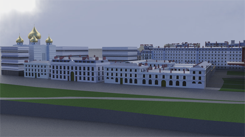
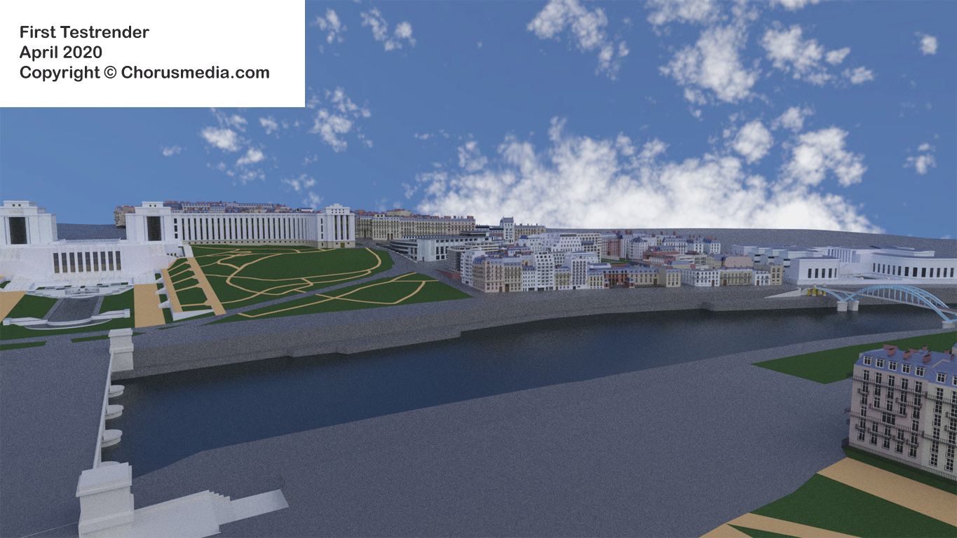
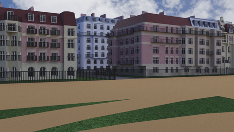
Test renders #1
I installed a lot of cameras which I surely won't use for the final renders. Just wanted to see certain things and had no thoughts at all about picture composition.
After all main purpose of those renders is to show problems, lacks, un-convincing elements. They're not meant to be published ;-)
I'm using some freeware HDRI sky background which I by default use for all of my outdoor scenes; might change it someday (same clouds in every render ;-).
Anyway - here are the renders:
Let's do some discussion:
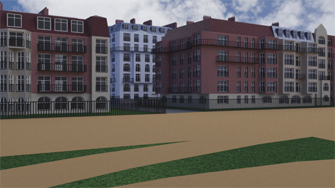
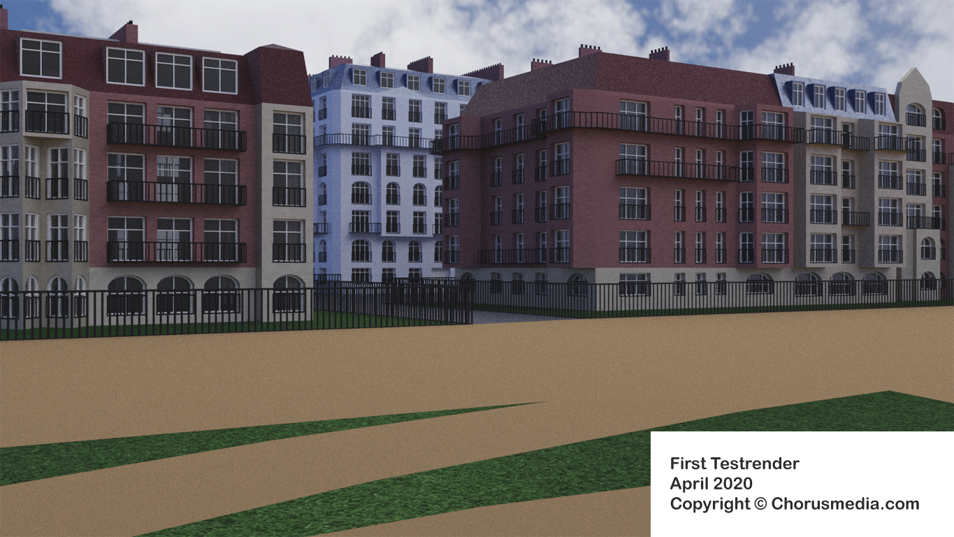
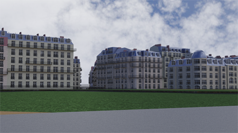
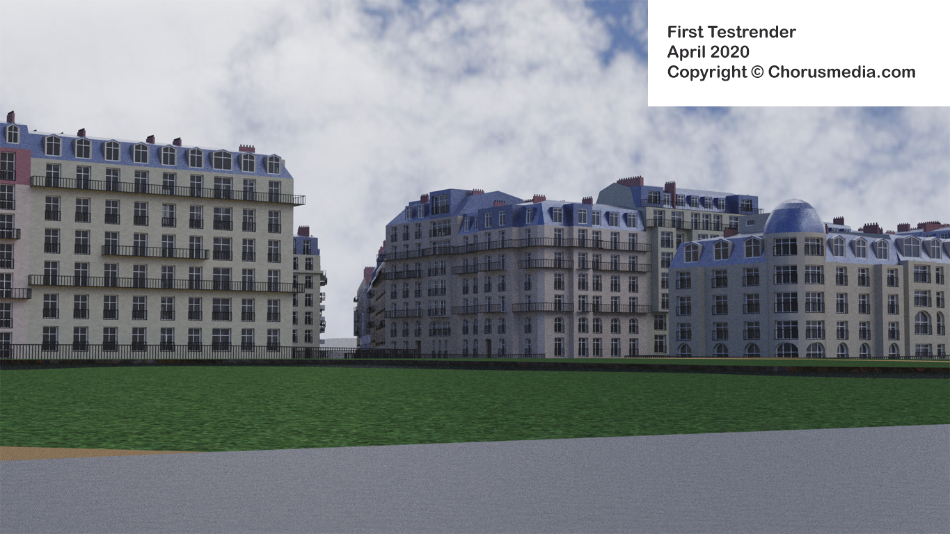
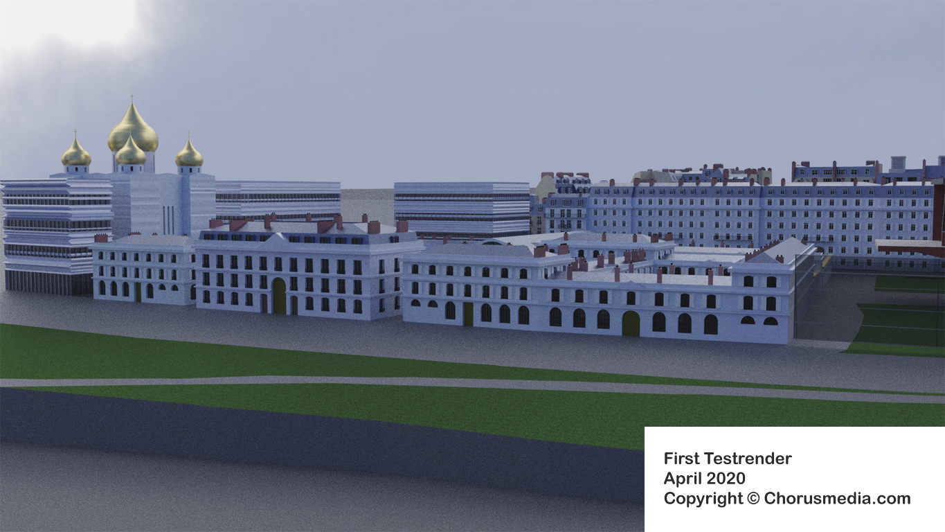
First (and quite obvious to see) is that some of the windows are way too large. Funny enough, because I did a lot of Internet research, looking for pics, trying to figure out proportions the best I could and always having a glimpse on metrical dimensions. Anyway, it doesn't help: it looks weird and therefor has to be corrected.
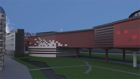
Next: I think my red brick material is much too dark. Surely will be corrected easily.
(Being a little child I grew up in a small town in Southern Germany - which hadn't too much to offer but its own jailhouse. The jail was built from red bricks as well and looked dark, gloomy and frightening. My red houses actually do remind me on that - which is of course "no go" for city houses in the City of Light and Love ;-)
Additionally the red houses shoudn't be simply red - photos show some decorative elements built of the yellowish stones. I thought about skipping them but now recognize they would help me to get the right atmosphere... I decided to add those details by the cost of some few verts.
There are some more topics just bothering me - e.g. balcony rails being quite "schematized". But I guess improving those would be rather oversized...
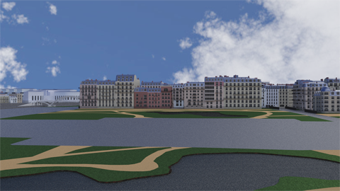
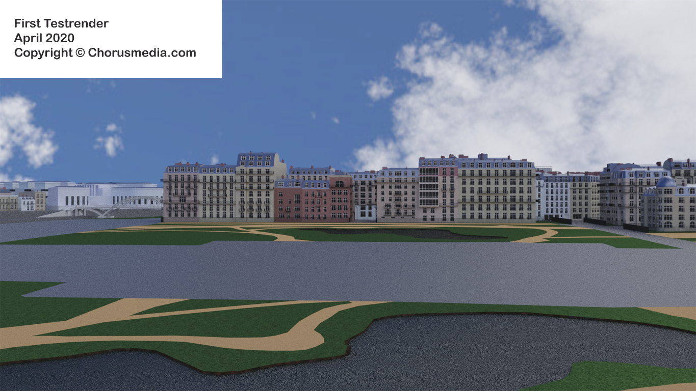
Let's respect that those renders offer a quite close view to background elements - which never have been planned to be watched so close.
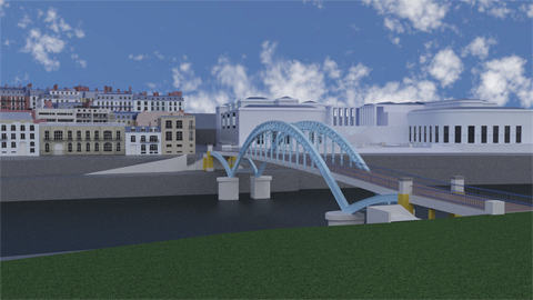
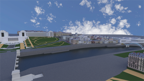
Let's drag our attention to the landmarks and prominent buildings.
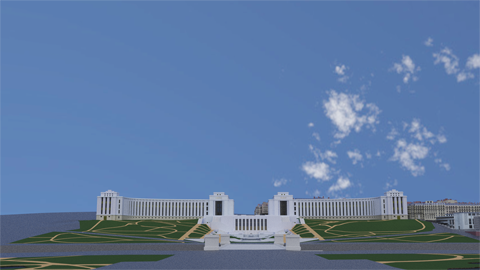
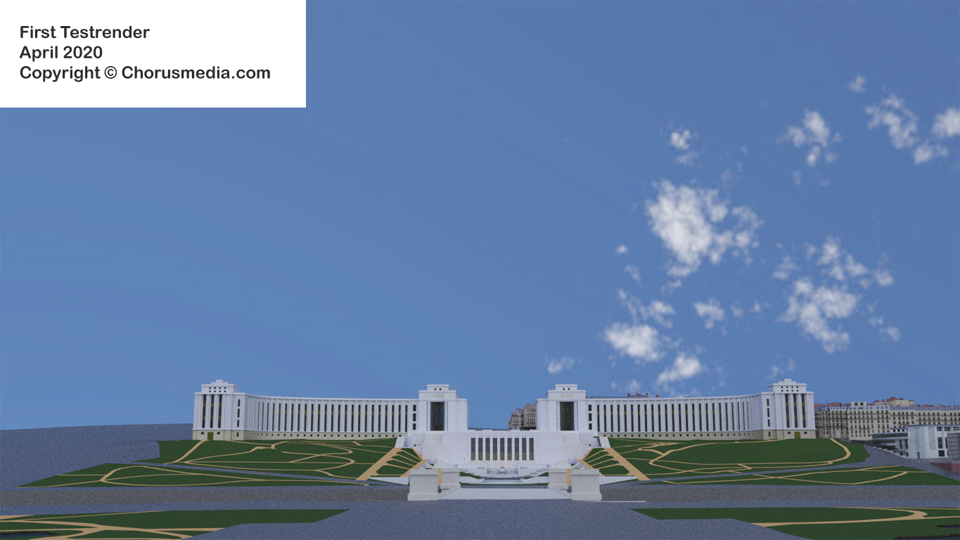
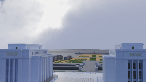
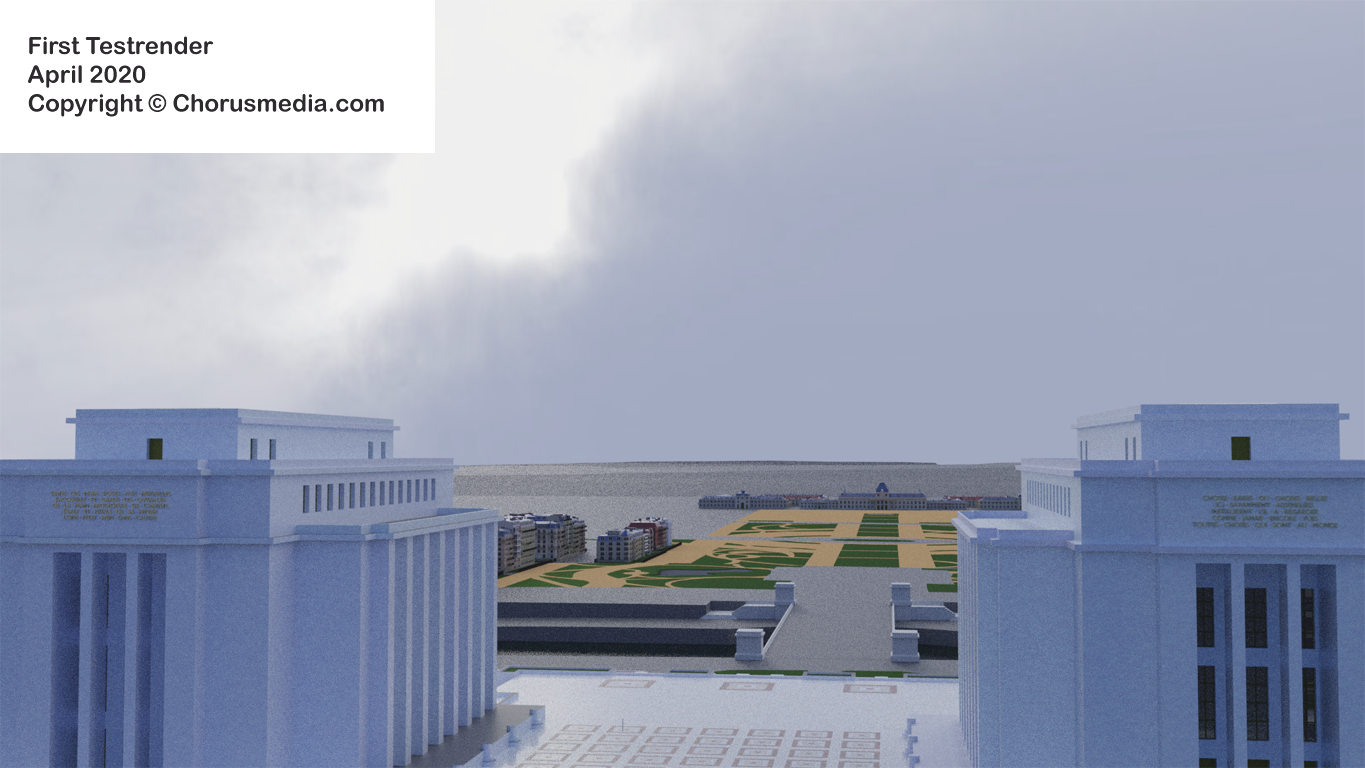
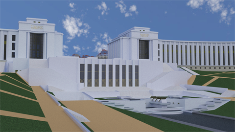
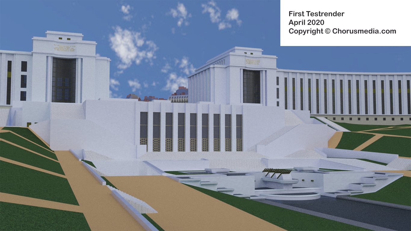
I simply love the Trocadero model (the new one, Chaillot, renders #4, #6 and #7). Some time ago I spent some time adding details, e.g. the golden letters on top, some mosaic to the floor... took me only few hours and was really fun creating.
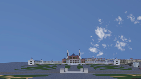
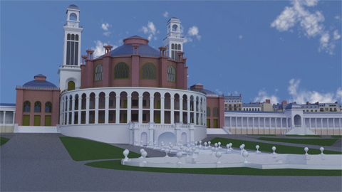
Unfortunately I do not have the same feeling about the old Trocadero Palais (renders #5 and #11). I love this building, but the model doesn't convince me.
Of course we do have the material problem: red bricks are too dark.
Another possible reason: opposite to the other buildings I didn't extrude the windows inward. I planned to put a focus on these interesting window frames - but that might have been a bad decision.
But I think the main reason is the fact of missing statues. The original building includes dozens of statues, and - respecting my PC's capicities - I skipped them. In this special case I think they are important, because they are part of the architectual style.
Anyway - having my PC's ability in mind I'm gonna live without statues for the moment.
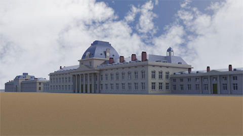
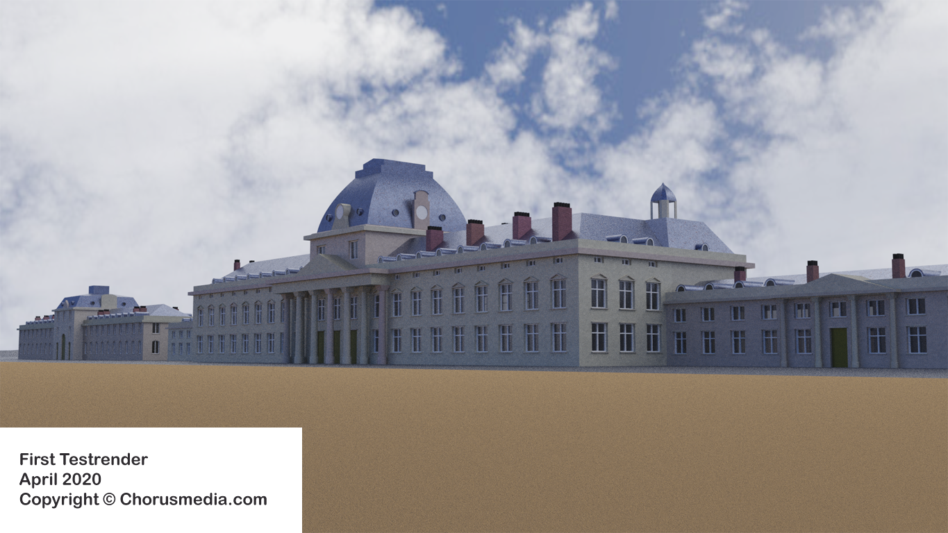
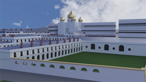
I think the Ecole Militaire is ok. Main thing bothering me is the surrounding surface, but I didn't work with that yet.
Watching carefully you'll recognize some building parts shaded slightly different. This is of course due to the use of randomness in the brick material. Seemed to be a good idea when used for multiple houses, but in this case I don't like it. I guess I'll do an additional brick material without any randomness for cases like this.
I don't like my Musée Quai Branly too much (render #9). But respecting that the lighting doesn't fit I think it's mainly a material problem. Proportions are ok, I think. And it's of course missing greenery.
Generally speaking I think it was a good idea to integrate all those city houses. Just have a look at the Trocadero / Chaillot renders: Comparing left part and right part of the pics shows you that the houses really do a good job and leave some "real life illusion". You don't need to have the houses completely visible; just seeing a corner here, a roof there is enough.
Of course it's a lot of work and time for only some few elements being visible in the pic - but on the other hand: the gain of realism being achieved is really precious; so in the end it's worth while.
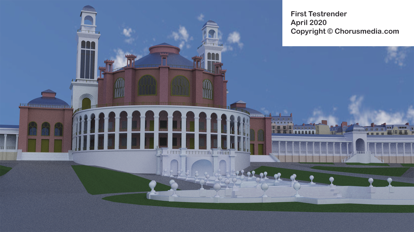
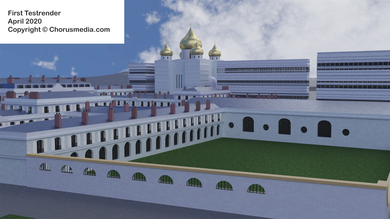
After doing some first corrections I got this:
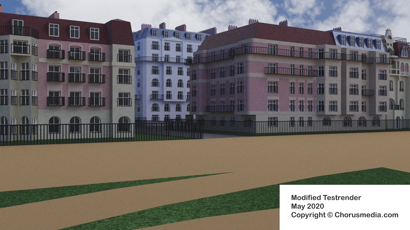
Not perfect yet, but much better.
Just watch the house with the funny turret on the very right: I didn't like the first version at all - obviously failed by catching its "logical structure". Second version is much better - it's almost a little piece of jewelry now. At the same time I think it fits into the ensemble, not outclassing the surrounding houses.
Just compare (it's 16 Avenue Élisée Reclus):
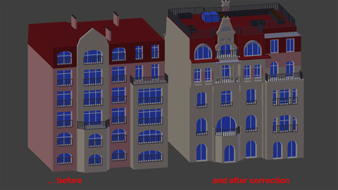


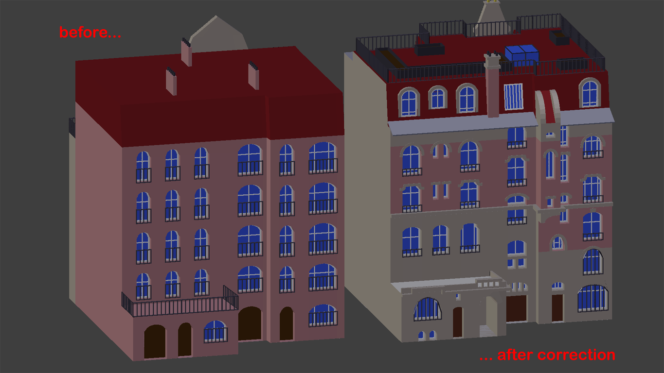
Again hardest was searching for reference pics on the web - corrections have been done in just a few hours.
This one gave me some really useful hints about detailling: Of course this single house is much more ambitious than the surrounding ones. Anyway it doesn't look like a "highlight" on the render (especially because it's placed somewhere outside and isn't focussed at all). Therefor it helps to improve the impression (the same than the first way destroyed it).
I have some two or three additional ideas 'bout detailling houses, but plan to do this somewhere in future.
Next I'm gonna add some greenery which I hope will help structuring the landscape. Of course the Eiffel Tower is surrounded by lots of trees and bushes, but furthermore I think greenery will help by defining roads and streets.